
TomTom Congestion Index
Infographics for the Congestion Index I made during the internship at TomTom, showcasing the congestion levels in cities and continents worldwide.
Infographics for the Congestion Index I made during the internship at TomTom, showcasing the congestion levels in cities and continents worldwide.

A dynamic data visualisation comparing the CO2 emission between the EUA and China. The fact that the US is a country with one of the highest number

A visualization of the 5 train options to travel from Amsterdam to Rotterdam Central Stations, considering delays.
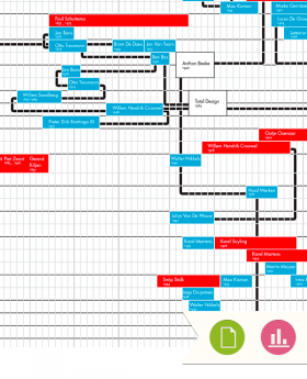
An Infographic of the Dutch Designers showing when they were born, where they studied, which design studios they started and